Internet Dashboard
The Internet Dashboard is specifically crafted to offer you a quick and comprehensive overview of your internet connection’s latency and quality. Once activated, monitors are established to track each step of your internet connection, evaluating latency and jitter at crucial points including your router, your ISP, and up to 10 Internet sites.
In addition, the dashboard shows the upload and download speeds of your Mac along with those of your router (if set up). If enabled, the dashboard also runs periodic speed tests of your internet connection and shows the result of the last one.
You can configure all of these settings in Internet Dashboard settings.
The path to the internet
Section titled “The path to the internet”The Internet Dashboard shows the full path your traffic takes to reach the internet, in four columns — This Mac, Router, ISP, and Internet — with your connection’s grade on the right.
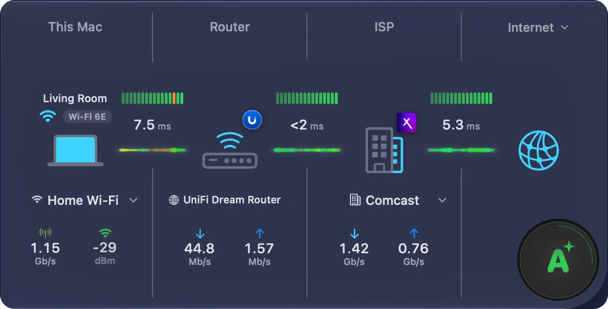
Each column shows its name, the latency to the next hop, and (where it applies) a pair of speed readouts. The sections below cover each column in turn.
In a narrow window
Section titled “In a narrow window”When the main window is one column wide, the dashboard shows the path as rows, one under the other: This Mac, Router, ISP and Internet. Between two rows, a thin row shows the latency of that hop, with its timeline. The grade sits at the end of the Internet row.
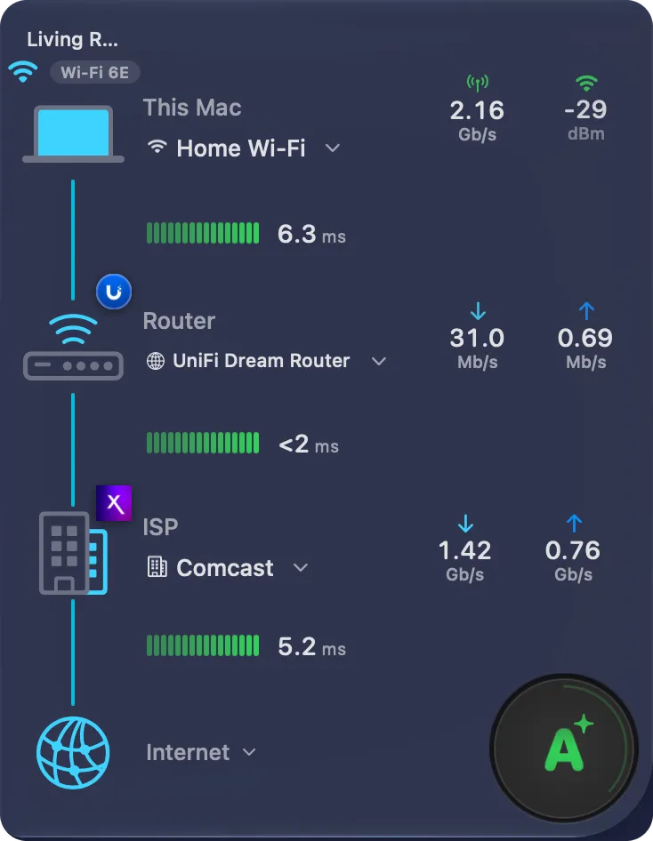
When the dashboard is collapsed, its header shows a one-line summary. See Collapsed sections.
Columns and cards
Section titled “Columns and cards”Each column name is a plain label. A chevron at the top right of the column shows that it has a card with more details.
- Hover anywhere over a column to highlight it.
- Click the column once to open its card under it.
- Click again, click outside the card, or press Escape to close it.
Every card has the same layout: a header with an icon or a logo, a name and one line about the item, then a panel of live figures, then sections with small headings. Hover over a row with an address to see a copy button. Hover over a figure or a row that has an explanation to see an i, and click it to read the explanation.
Reading the speed readouts
Section titled “Reading the speed readouts”Each pair of readouts shows two large numbers at rest — download (↓) and upload (↑). Both numbers of a pair use the same unit, with about three significant digits.
Hover over the column to see more:
- the arcs, which fill to show each speed against its maximum;
- the caption of the pair — Throughput, Signal, Tx Rate or Speed test;
- the page dots, when the column has more than one pair.
Reading the latency timeline
Section titled “Reading the latency timeline”Every column shares the same latency timeline. Once you can read it in one column, you can read it in all of them. A healthy hop shows only the timeline, the latency and the connection line. The status and the warnings appear only when the hop has a problem.
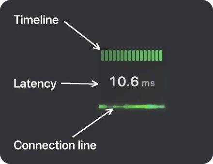
| Element | Description |
|---|---|
| Status | A coloured dot and label (Light congestion, Heavy congestion or Error) for the latency of this hop. It shows only when the hop has a problem. |
| Timeline | A bar graph of recent latency readings, newest on the right. Each bar is colour-coded from green (Good) to red (Error) so you can spot recent trends and spikes at a glance. |
| Latency | The current latency to the next hop (e.g. 10.6 ms), as a large number with a small grey unit. The number takes a colour only when there is a problem. A latency under 2 ms reads <2 ms. |
| Packet Loss Warning | A drop icon that appears beside the latency figure when packet loss exceeds 1% on this hop. Click the latency to see more detail. |
| Jitter Warning | A waveform icon that appears when latency is varying significantly — high jitter, which can disrupt video calls and gaming. Click the latency to see more detail. |
| Connection line | A plain line in the colour of the hop’s health joins the hops. With Connection particle effects turned on, animated particles flow along it to show live traffic. The effect is off by default. |
Hover over a latency to see an i. Click it to open an explanation with the current latency of the hop, and its packet loss and jitter when they matter. A second click, a click outside the explanation, or Escape closes it.
Router to ISP and ISP to Internet
Section titled “Router to ISP and ISP to Internet”The latency of these two hops is an estimate: PeakHour takes the latency to the far end and subtracts the latency to the hop before it. It never reads 0.0 ms — a hop too short to measure reads <2 ms. When PeakHour can’t measure the hop on its own, a caption explains the value:
- Whole path — the value is the latency of the whole path from this Mac, because PeakHour can’t measure the hop between the two ends.
- Slow ISP hop — your ISP’s router answers pings more slowly than the sites behind it, so PeakHour can’t measure the hop from your ISP to the internet.
The caption shows in the explanation of the latency, and beside the monitor in Latency Monitors.
This Mac
Section titled “This Mac”The This Mac column represents your Mac’s connection to the local network. It’s the first column in the path to the internet.
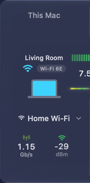
The column shows, from top to bottom:
| Element | Description |
|---|---|
| Access point | On Wi-Fi, the name of the access point that your Mac is connected to shows above the Mac icon, for example Living Room. A name in grey italics is a guess from the maker of the access point. To give the access point a name, click the pencil beside Access Point in the This Mac card, described below. On a Personal Hotspot, the name of the hotspot shows. When the access point has no name, nothing shows above the icon. |
| Wi-Fi standard | On Wi-Fi, a small badge beside the Wi-Fi symbol gives the Wi-Fi standard of the link, for example Wi-Fi 6E or Wi-Fi 7. On Ethernet, there is no badge. |
| Latency | The figure beside the graph (e.g. 4.7 ms) is the latency from your Mac to the next hop. |
| Icon | The icon matches your Mac: a MacBook, an iMac, a Mac mini, a Mac Studio or a Mac Pro. |
| Name | Your active connection — for example, the name of your Wi-Fi network. On a wired connection, it reads the name of the adapter, or Ethernet. |
| Throughput | The pair shows real-time download (↓) and upload (↑) speeds for your Mac. On Wi-Fi, a second pair shows the Tx Rate and the Signal of the Wi-Fi link. To see it, swipe left or right on the trackpad, or click the page dots under the pair. The page dots show when you hover over the column. |
Click the column to open its card, with full details about your Mac’s connection to the local network:
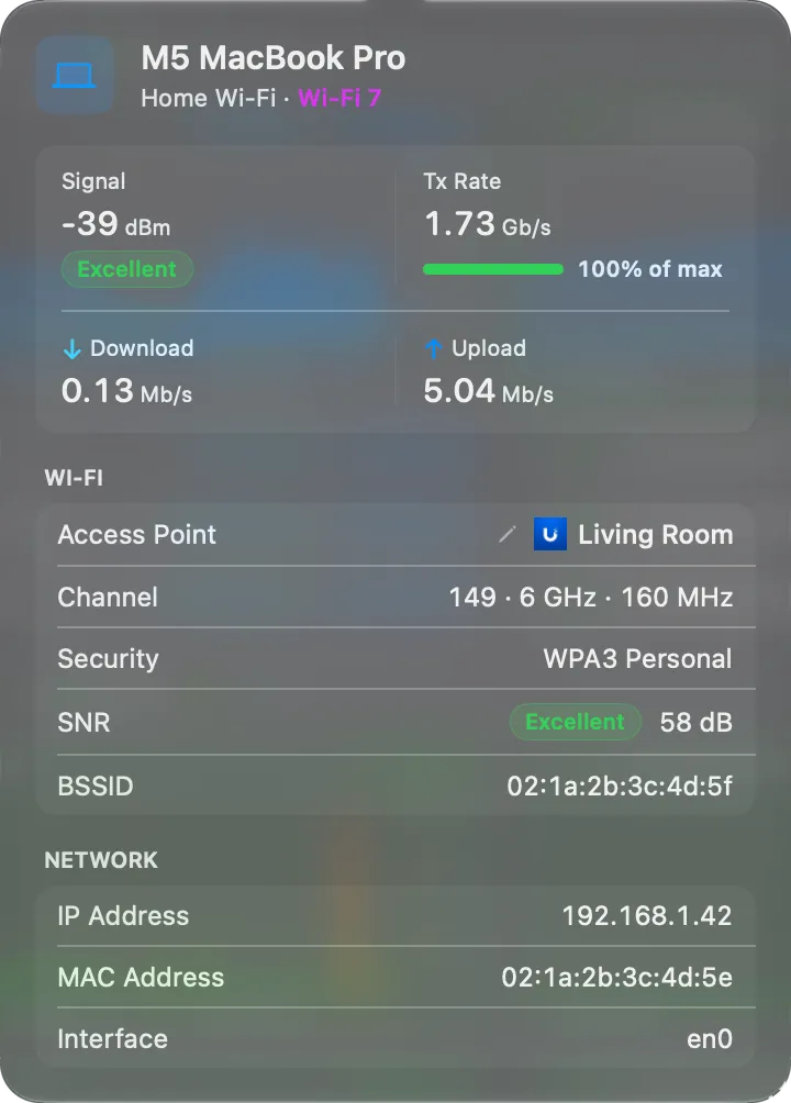
The header shows your Mac’s model (for example, MacBook Pro 16-inch), then your Wi-Fi network and its Wi-Fi standard (for example, Wi-Fi 6E).
| Figure | Description |
|---|---|
| Signal | Wi-Fi signal strength in dBm, with a pill: Excellent, Good, Fair or Poor. Values closer to 0 are stronger (e.g. −32 dBm is excellent; −75 dBm or lower is weak). |
| Tx Rate | The current transmit link rate between your Mac and the access point — not your internet speed. A bar shows it as a share of the highest rate that the Wi-Fi standard and channel width allow, for example 72% of max. |
| Download, Upload | Your Mac’s live throughput. |
Under the figures, the Wi-Fi section shows:
| Field | Description |
|---|---|
| Access Point | The name of the access point your Mac is connected to. Click the pencil beside it to rename it. |
| Channel | The Wi-Fi channel, band, and channel width in use (e.g. 85 · 6 GHz · 160 MHz). |
| Security | The Wi-Fi security protocol (e.g. WPA3 Personal). |
| SNR | The signal-to-noise ratio in dB, with a pill: Excellent above 40 dB, Good 26–40 dB, Fair 16–25 dB, Poor 15 dB or less. |
| BSSID | The hardware address of the access point your Mac is connected to. |
The Network section shows your Mac’s IP Address, its MAC Address, and the macOS Interface name (e.g. en0).
Router
Section titled “Router”The Router column represents your internet router or gateway — the device that connects your local network to your ISP.
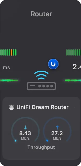
Because the router sits in the middle of the path, it shows a latency graph on each side — one for the hop from This Mac to the router, and one for the hop from the router to your ISP.
PeakHour displays the detected Internet Gateway in this slot, recognising many router brands and showing the manufacturer’s badge (for example, the UniFi logo) on the device icon. For more on configuring a gateway, see First Time Setup and Settings → Bandwidth Monitor.
| Element | Description |
|---|---|
| Latency | The figures beside each graph are the latency to the router (left) and from the router to your ISP (right). |
| Name | The name (e.g. UniFi Dream Router) of the Bandwidth Monitor representing your Internet Gateway. It’s normally detected automatically, but you can designate it manually in Settings. If no Bandwidth Monitor is detected or designated, the column shows the default gateway’s IP address instead, and the throughput readouts stay empty. |
| Throughput | The pair shows real-time download (↓) and upload (↑) throughput reported by the router. The arcs fill relative to the gateway’s Bandwidth settings. While the maximum is Automatic, your Internet plan sets it. |
Click the column to open its card, with details about your router:
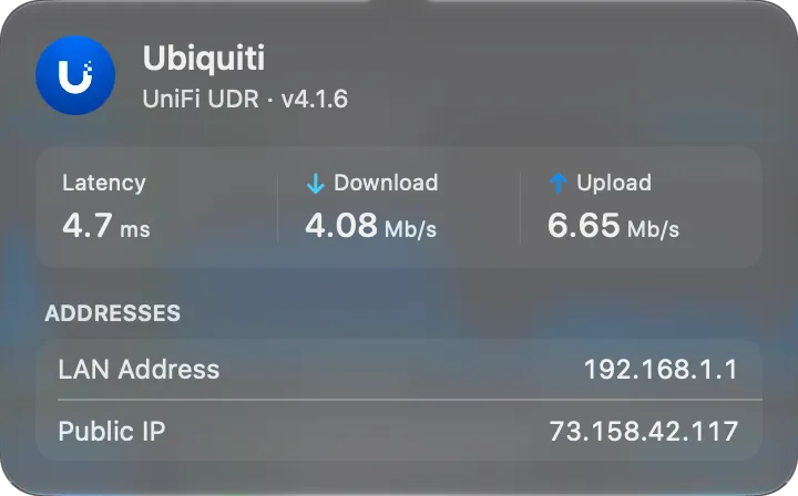
The header shows the router’s name as the dashboard shows it, with its maker and firmware under it.
| Field | Description |
|---|---|
| Latency | The latency from this Mac to the router. |
| Download, Upload | The live throughput that the router reports. |
| LAN Address | Your router’s address on your local network (e.g. 192.168.1.1) — typically the gateway your devices connect through. It reads LAN Host when you added the router by its host name. |
| Public IP | The public IP address your ISP has assigned to your router. |
The ISP column represents the connection from your router out to your internet service provider.
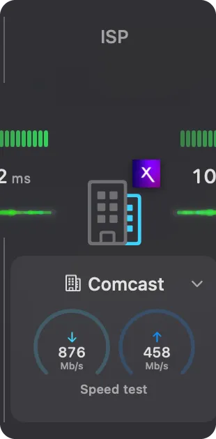
Like the Router, the ISP column sits mid-path and shows a latency graph on each side — the hop from your router to the ISP, and the hop from the ISP out to the internet. PeakHour identifies your ISP and shows its badge on the building icon.
| Element | Description |
|---|---|
| Latency | The figures beside each graph are the latency from your router to the ISP (left) and from the ISP to the internet (right). |
| Name | The detected ISP (e.g. Comcast). |
| Speed test | The pair shows the download (↓) and upload (↑) speeds of your last speed test — not real-time throughput. |
Click the column to open its card, with your last speed test and details about your ISP:
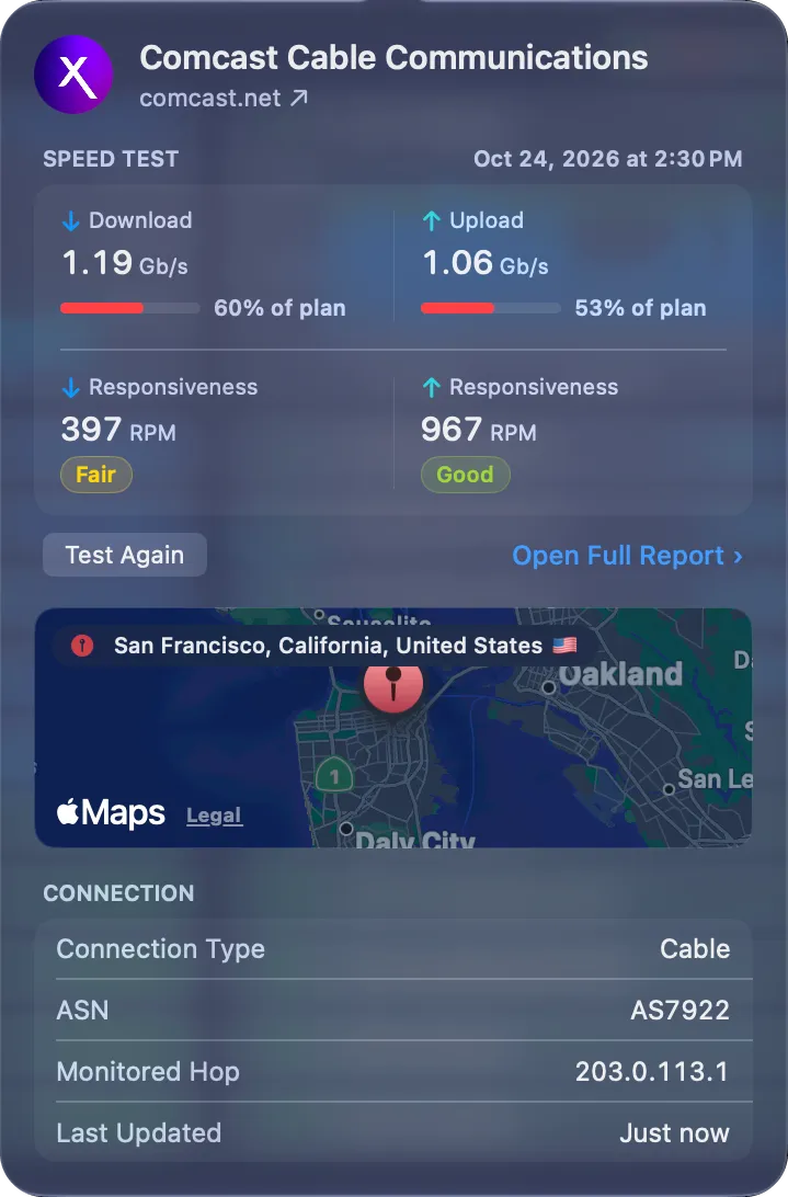
The header shows your ISP’s logo and name (e.g. Comcast Cable Communications), with a link to its website.
The Speed Test section shows the time of your last test, its Download and Upload speeds, and the download and upload Responsiveness in RPM, each with a pill. With an Internet plan set, each speed has a bar such as 82% of plan.
Under the figures, click Test Again to run a new test. Before your first test, the button reads Run Speed Test. While the test runs, the button shows Testing… and Cancel, and the card stays open. The figures update when the test ends. While a test can’t start, the button is grey: hover over it to see the reason, for example Offline.
Click Open Full Report › under the figures to see the whole test:
- on macOS 26 and later, the card closes, and the PeakHour Advisor opens on its Speed Test page;
- on macOS 14 and 15, the card closes, and the full test opens in a popover on the dashboard. See Speed Test on macOS 14 and 15.
Under the speed test:
| Field | Description |
|---|---|
| Map | The approximate location of your ISP, derived from your public IP address. Right-click it and choose Open in Maps to see it in Apple Maps. |
| Connection Type | The detected connection technology (e.g. Cable, Fiber, DSL). |
| ASN | The Autonomous System Number identifying your ISP’s network (e.g. AS7922). |
| Monitored Hop | The address of your ISP’s router that PeakHour pings to measure the ISP hop. |
| Last Updated | When PeakHour last refreshed this information. |
When Provider Lookup is off, the card still opens with your last speed test. Its title is then ISP.
Speed Test on macOS 14 and 15
Section titled “Speed Test on macOS 14 and 15”The PeakHour Advisor needs macOS 26 or later. On macOS 14 and 15, Open Full Report › on the ISP card opens the full test in a popover, with the title Speed Test. The test measures more than raw speed. It also measures how responsive your connection stays under load. This value shows better how video calls, games and web pages feel.

The popover has the layout of the column cards. The header shows the time of the test and the interface that it used. Under it are four figures: Download, Upload, and the download and upload Responsiveness, in Round-trips Per Minute (RPM).
Click Show Details to see three more sections:
| Section | What it measures |
|---|---|
| Idle Latency | The time to start a connection while nothing else uses the network (Base RTT, TCP, TLS, H2). Lower is better. This is the baseline for how quickly new connections start. |
| Latency Under Load | The latency while the test fills the connection, for download and for upload. Spikes here show bufferbloat: congestion that delays interactive traffic, such as video calls and games. |
| Test | How the test ran: the interface, the server, the protocol, the number of flows, the data transferred, and the duration. |
For what each value means, see Speed Test. The popover shows the results of the last test. It doesn’t run a new test. To run a new test, click the refresh button (Run Speed Test) at the top of the popover.
Internet
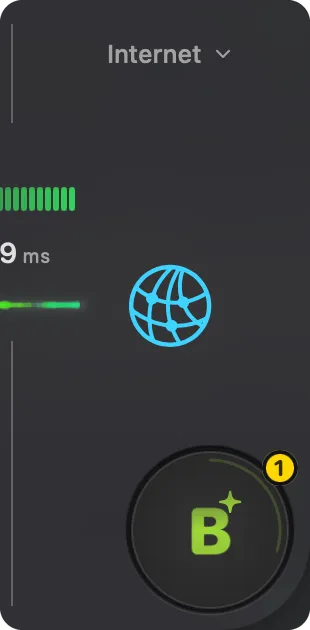
Section titled “Internet”The Internet column represents the final hop — from your ISP out to the wider internet. It’s the end of the path, so it shows a single latency graph (the hop from your ISP to the internet) alongside a globe icon.
| Element | Description |
|---|---|
| Latency | The figure beside the graph is the latency from your ISP out to the internet. |
| Grade | The overall connection quality grade, described in Grade below. |
PeakHour measures the final hop with a list of up to 10 Internet sites, and combines them. The latency is the median of the sites. The Internet is unavailable only when more than half of the sites fail. By default, the sites are Google, Cloudflare and Netflix.
When one site has a problem and the others don’t, the status names it, for example Netflix not responding.
Click Internet at the top of the column, or its graph, to open the Internet Sites popover, with the status and latency of each site:
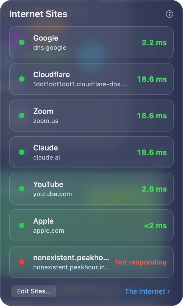
See The Internet Sites popover. To change the sites, click Edit Sites… in the popover, or open Settings → Dashboard → Internet Sites.
The large badge at the end of the dashboard is your connection’s grade — a single letter from A+ down to F for your whole connection, based on latency, jitter, packet loss, speed, and responsiveness under load. See How the grade works.
- Click the grade to open the PeakHour Advisor, which explains the grade, shows where any problem starts, and suggests what to try.
- A number on its rim shows how many issues hold the grade back, in the color of the worst one.
- The ring around it counts down to the next update. PeakHour grades your connection every 30 seconds. When the grade changes, it pulses once.
While the Advisor section of the main window is expanded, the grade moves into that section, and the dashboard shows no grade.
The grade needs macOS 26 or later, and AI Advisor turned on in Settings → Dashboard. With the AI Advisor off, the button shows a stethoscope and the word Advisor instead of a grade. Click it to open the Advisor window, which still shows your speed tests, your history and the routes to each site.
- By default, PeakHour uses differential latency to measure the round-trip time between two hops. For example, the latency shown for Router → ISP is the time a packet takes to travel between your router and your ISP, not between your Mac and your ISP. See Router to ISP and ISP to Internet.
- You can customise any of the monitors that power the Internet Dashboard under Settings → Monitors. If you delete one of these monitors and want it back, turn the dashboard off and on again: PeakHour creates only the monitors that are missing. See Recreating Internet Dashboard monitors.
- If a high-CPU-usage indicator appears on the dashboard, your Mac is under heavy load, which can affect the accuracy of latency measurements.
Was this page helpful?
Found something wrong, unclear, or out of date? Let us know and we'll fix it.